Friday 28 September 2012

Research and Planning: shot types

Here are a range of different shot types from close ups to long shots, wide shorts to birds eye view, each shot has a different purpose and aids in dramatic effects and to convey the emotion of the story. for any type of media. for my magazine I have used a medium close up, this shot is taken from the waist up. and usually used for magazines because it can show the emotions in the face and the audience can relate to the image and text going with them.


Wednesday 26 September 2012

Research and planning: College magazine evaluation


Here are the Front Cover and Continence page for my College Magazine I design. On the front cover I have listed a range of topics available and interesting to college students these include sport activities, trip they can go onto and thinks that are happening in college or near by.
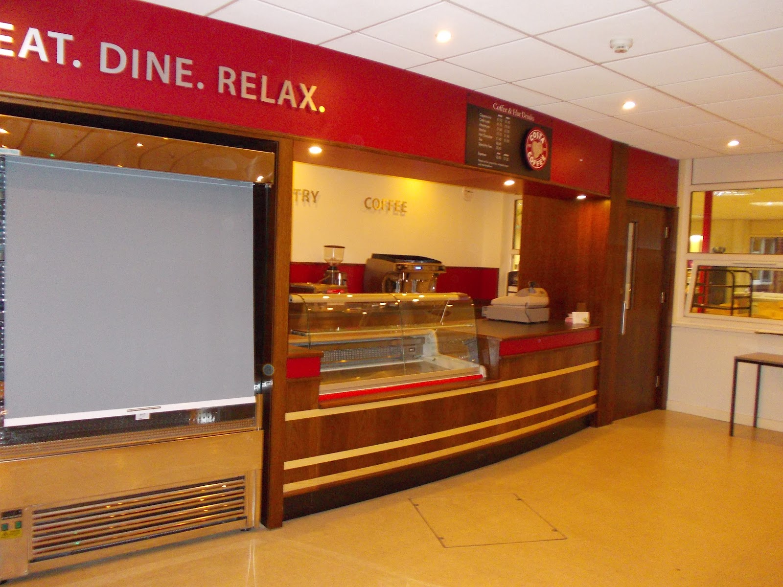
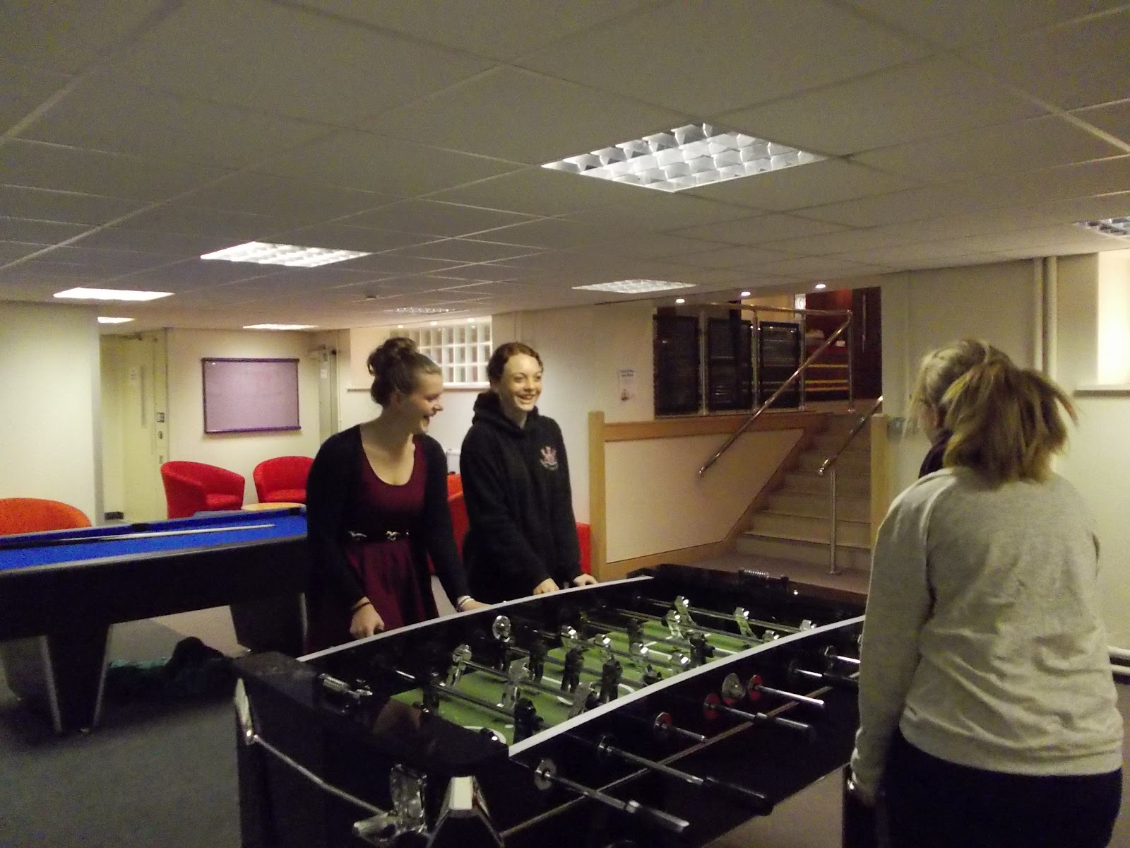
The contents page consists or a range of article in the magazine and page numbers you can find them. I listed the articles of the front page and added other article about the new chill out area and a art exhibition. i also added a QR code which allows a smartphone to scan it, which sends them to the magazine website.

  FRONT COVER

what went well. I really think that I kept to the three colour rule, which means through out the magazine you only use three colours for the text and background. the colour I chose work well in my opinion with none being too bold and looking out of place, the maroon/red for the title works really well because it grabs your attention and isn't consistent with the research I had done. as always black suits where every it is used. the only thing I am not happy about its theres a white background and looks like there should be something there, I could have taken another picture e.g. of a wall to add depth and also fill in the space, which I would have do if I can more time. its not a rule but I think I might have used too many fonts which may distract customers, I should have kept with one or two main font, this will make it more processional and presentable.

CONTENTS PAGE

I think the amount of pictures used compared to text is reasonable and size is big enough to see but doesn't overpower the page, using a QR bar code if the magazine went  on sale will appeal to the student market because you can easily access the website from a smartphone with camera, I stuck to the three colour scheme again using red and black with a white background  although its only a draft and doesn't need to be complete, I would have like to put more information on the page to fill more of the white spaces, white was probably the wrong colour in hindsight because it makes all the pages look unfinished. with a border on the page I'm not sure if it looks too formal for a college magazine and if so the actual colour doesn't match with the title colour which it should. Finally my worst enemy spelling, its unacceptable when it takes two seconds just to double check and use a spell checker.
                  

Monday 24 September 2012

Research and Planning: Photo's

Here are a range of pictures I have took going around the college which I might use when completing my magazine cover and content page, some of the pictures are very simple and I find wouldn't benefit the final pieces such as the darken picture of the girl on the balcony. 


I like the image due to the work behind her it gives depth and relates to the magazine

This image is not good and I wouldn't use in my magazine due to the orange ting to the image this is due to low key lighting and using a digital zoom at the thoroughest zoom


I will uses this action shot because of the depth and action of the image showing the facilities available to students


Tuesday 18 September 2012

Research and planning: Interviews

As part of a course I conducted 3 interviews to get feedback about possible improvements and things that should be deleted on are magazine cover,I found this very interesting and useful.
I started by asking why does the magazine looks suitable for the target audience (college students) 
and the feed back they gave was positive but some one word answers of just YES 
2nd do you think theirs anything similar on the market everyone said there was similar magazines on the market and stated it was "unique" and very informative 
what do you think are the strong points. the strong point are its easy to read, looks very interesting and keeps you updated with recent events 
anything you don't like or needs to be improved. Spelling was the biggest mistake I made its easily fixable and I shouldn't have presented it.apart from that a larger picture is needed to fill the empty space   
are you willing to pay for this magazine if its a reasonable price, the price suggested was 75P-£1 I find this reasonable and especially if the prostheses go to charity 

I am thankful of there honesty and contribution to my magazine I have taken there advice and imported it into the finished cover 

Research and planning: Semioticand font activity

here using Photo shop and Dafont. i have picked 3 different text font styles to suit there appropriate  masthead after analyzing semiotic, the 3 fonts i used are copper std,black widow and relief BD
I chose these fonts because they suited there theme
pop word is very bright and rounded font what I like.
death mental I love the cobwebs but I don't know why there's a question mark at the end of it, can not get rid of it.
I really like the popcorn text because it reminds me of the cinema cartoon sort of fonts and I find really suitable for the text 

Friday 14 September 2012

Research and planning: Interview Questions

Interview Questions:I going to interview a couple of students to establish what are the good/bad and any improvements needed to the college magazine I am creating, the answers will be a great help working out what the students what in their magazine.

1. does the magazine look suitable for its target audience( college students)
2. do you think theirs anything similar on the market
3. what do you think are the strong points of the cover
4. anything you don't like or needs to be improved
5. If you would be willing to pay for this magazine what is a reasonable purses price

Thank you    

Wednesday 12 September 2012

Research and planning: Medium close-up shots


Here are a selection of photo's of Medium Close-up shots, these are where the photo's took from the chest upwards of the person.

Tuesday 11 September 2012

Research and Planning: College Magazine Analysis


This magazine is aimed and design for college students. we know this my a couple of factors which include the mast head.
The Mast head is the first indication that it is aimed at students with the title "COLLEGE" 

Secondly the cover lines give an indication with headlines like Nastia Liukin on SMU's campus, easy indication because students live on a campus while studying and she's 15 & pregnant, relative news with the market the magazine is publishing act.

The publication line "college max edition" which is a massive hint to who its aimed at.
The main picture depicts a young lady in casual cloths with a I Love SMU which is a college in America, this with all the other information gives a conclusive indication that is a student magazine.
the Age this magazine is depicted at is 18-21 year old. this is because the American terminology for University is College.America students finish high school at 18 where as we finished at 16  


Research and planning: InDesign Tutorial

Here is a film review of the Dark Knight, which I used to create my own article on Adobes In Design
first to speed up the proses I copied the article on to a word document, then copped it into In Design. using the fetchers provide I created column, by first clicking on layout then create guides, this gave us columns going down the page giving us the typical layout of most newspapers and magazines. next to add the text we simply clicked file. then place. (simple) this gave us the review in a drag and drop format,when the first column was complete simply click the small + sign to continue adding the article until the page was complete full.
to add the picture its the same as the text. file. place. this gave us the picture in the center of the page. highlight and drag to move.
T button gave us the option to create are title, simply write and edit colour and font.
to create the background colour I filled the page with the rectangle function filled it with the green colour, then right click then select back of document. then simply remove the columns and it was done :)   

Friday 7 September 2012

Research and planning: film poster

This is a Photoshop adaptation of the Casino Royal film poster with Morgan Freeman face imported and placed over the original picture. my opinion would make a better bond.

First I selected the picture of Morgan Freeman from Google and simply dragged in to Photoshop this came up as a new window. In Photoshop using the magnetic lasso tool I started to cut around Mr Freeman's head and simply ether cut and copy onto the poster background or drag and dropped it onto the film poster. using the move tool and rubber I carefully reshaped his head to fit in with the space provided in this case where Daniels Crag head once was all this was done on a new layer making it easier to edit future reference. Using image adjustment we could change the image balance and contrast. giving the Finnish piece here. Apart from the random brown dot on his neck I don't think is all that bad for my first go :)

Wednesday 5 September 2012

Research and Planning: Skin tutorial

The skin tutorial showed us some of the more different uses for Photoshop as well as the tools. Are aim was to get her to magazine vogue style. we started with the picture of this lady but she had a couple of defects and no make up.
we started by using the smart blur effect this faded and slightly blued the picture on  a new layer by copying the first original picture and fading its opacity to around 60% it got rid of large blemishes and the flash shine in the right cheek.Next we used a couple of tools which include the paint brushes with the opacity and mode changed to give the blusher effect to the cheeks and the eye lasses this was also on a new layer . also using similar tools I changed her hair colour giving shading and hight lights. To get rid of her spots the clone stamp picked a area free of spots and stamp it over the spot, this gets rid off all spots but doesn't make it  noticeable.

Tuesday 4 September 2012

Research and Planning: Photoshop tutorial

Firstly we started with a range of images and given the brief to uses them to create a CD cover. picture left.
To start with we dragged the images on to Photoshop and started to edit them, to cut the out we used the tool eliptical marquee to cut around the CD and dragged the cut image onto of the back ground.
To cut out all the small parts of the french horn theres a tool called the magic wand that selects all similar parts of a picture which you can edit in this case I deleted the spare image. Simply again dragged and drop on top of the image.
By clicking the T tool you can write texts on top of the image in this instance my name. with this tool you can also change font and colour.