Thursday 21 March 2013

Evaluation: Question 7 - Looking back at your preliminary task, what do you feel you have learnt in the progression from it to the full product?


The layout of the first magazine wasn't too bad all cover stories were in a column on one side with the masthead at the top, when creating the magazine I didn't think of how to place the image and to link the text with it as you can see the image is to small and doesn't fit the page and there's too much white space, going back to the columns and the fonts used the column is canted at a strange angle and isn't straight making it look very unprofessional as I learn't later on in the project you should stick to one or two fonts through out your magazine I used 6 just on the front cover. compared with the music magazine where I used two I also thought about the use of colour on the second magazine how it would link in with your genre.
The image I choose was taken on a compact camera in a low light area shown by the yellow tinge on the image compared with that the music magazine image was taken on a SLR camera with a fixed light as you can see the resolution and clarity of the image is much better, with the college magazine i didn't fully understand what you need to do to convey the genre of the magazine if it take the college masthead off you would have know it was to do with a college I should have but in props in like a backpack or books which is meis on sen.


Theres a drastic difference in terms of everything on the two content pages the layout out of the college magazine is very poor and looks more like a poster with simple text and images to the side and a border, in the music magazine I learn't about page furniture and what is really needed on a page and how each thing has to work together like linking the text with the images shown on the right by a simple page number in the corner of each image, on the college magazine again their way too much white space on the page. the choice of fonts i found in the second magazine is vital to what message you want to convey the left is very generic and simple all one font and one colour, the right I used two fonts one large bold font for the masthead and heading and a simple easy to read font for the bulk of text. as i said with the front cover the images are very poor and do not link with the genre of the magazine, they were taken in a rush with no planning and added just because they were the best ones, with the music magazine I tried to link the images with the text with the number in the image corner I also thought about what the target audience would be interested in. I find that creating it for a target audience in mind allows you to create the best magazine for the particular genre with out stepping out of the limits.

Evaluation: Question 6:What have you learnt about technologies from the process of constructing this product?


I have used Blogger to document all the research and planning through out my magazine as well as the development and in the evaluation to show all my work as well. each lesson I tried to upload a new page on blogger describing what I have done in that lesson and detail and processed I have learnt or used.
I used the SLR cameras when taking the pictures for my magazine, they took great quality images with a range of setting to get the right image and the manual focus work really well when focusing on one certain area 

I used flickr to upload my magazine pages and to talk about Media Distribution 

iPhoto was used to upload all the images taken from the SLR onto the iMax's it allowed me to choose the one's i wanted to keep and delete 


I used iShow to display in my research and planning the progress I made so far and highlight key areas I have learnt 

Photoshop was the main program I used when creating all the pages of my music magazine, It allows you to edit pictures and text and can import them onto new or existing documents and create your own designs by using a range of layers and unique features

I used Prezi in my evaluation to talk about Question 5 and used it in my research and planning


 I used indesign for the content page of my college magazine because it works like Photoshop but have some unique features

Tuesday 19 March 2013

Evaluation: Question 4 - Who would be the audience for your media product? Why?

I  have drawn a person how would be the main target audience of my magazine and young 15-24 year old male how loves rock music and has a bit of spare cash to buy the monthly issue of my magazine. I would think they would be well dressed and have a hand in the latest fashions due to having a part time job, I also would think they would be slightly creative "being in they own band " and "writing his own music" I would think a stereotypical teenager with a slight quirk will be the moist suitable for my magazine.

Evaluation: Question 3 What kind of media institution might distribute your product and why?

media magazine 3media magazine 2

media magazine 1

Evaluation: Question 2 How does your media product represent particular social groups?

How does your media product represent particular social groups?
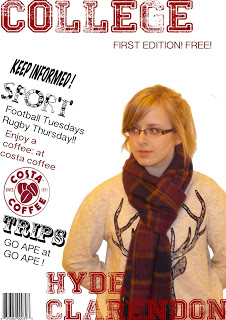
Posture: The two models have a similar facial posture looking directly in the camera to give the impression there looking at you, the man on the right has a more harsher look with the lower eyebrows. the two models body posture  are different,the one on the left is very straight and sort of blends in with the background, where as the man on the right is leaning forward giving the impression of being more sociable.  

Angle: both shots are at eye level straight down the camera lens so it looks like the model is looking at you, this shows dominance and self confidence because its a bold shot showing they don't shy away. The reader can also associate with the model and cm give an idea of the genre of magazine which intern could sell more magazines.

Shot type: both shots use a medium to close up shot, I think is a good shot to use when you want to focus on the facial expressions of your model. which can convey the mood the model is in giving the reader a impression on what the article might be about.
Lighting:the lighting differs with the two models the one on the left uses a key light setup with one light positioned to the right shadowing the left side of his face giving the impression of two sides of his life or there's something to hide, the model on the right uses a key light as well as a fill light illumination the whole face giving the idea of a man who has nothing to hide and possibly sociable and friendly
   
Costume: the model on the left is wearing a multicolored jumper which is popular at the moment, by dressing him in this I wanted the readers to associate with the model, but focus more on the face. The model on the right is wearing a simple black T-shirt, to blend in with the background again to make the face stand out due to the contrast between the colours.

Expression:both have a similar expression of a blank face with a slight smile,giving the impression there serious. both models have there eyes straight at camera to show there emotions.

Hair: the model on the left has a long fringe swept across his face giving the impression hes got little confidence and possibly a bit insecure where as the model on the right has his hair short and spiked up like hes just woke up giving the impression he goes with the flow of life and doesn't care about his personal appearance

Overall: My magazine is aimed at the male sex due to the selection of photo's I have chosen to use, though the magazine I tried to depict most emotions men might feel from being insecure and something to hide on the front cover to dominance and self belief with the model on the content page, I tried to cater for the audience by giving a range of articles  

Wednesday 13 March 2013

Research and Planning:final magazine


Research and Planning: Final Double page spread

After talking with my tutor we found the previous design didn't suit the genre of music I was aiming for, so wee decided to change the layout of the page. As you can see the image has been enlarged and only covers one page and the article on the other, the inspiration for the page was 50 cents interview for Q magazine.    

Thursday 28 February 2013

Research and Planning: double page spread final design

After looking at the previous double page spread, even though it looked professional it didn't suit the genre and stile of the previous two pages, so I decided to change the design to look similar to Q magazine interview layouts.

Monday 25 February 2013

Research and Planning:Final content page analysis

Here is the final content page draft with some little errors for example I need to change the image of the front cover to a different one that will relate to an article and I think there's too much empty space especially at the bottom left but I am pleased with the text and layout of the content page.

Wednesday 30 January 2013

Research and Planning:Magazine Front Cover Final Development

Although I am please with the outcome of the development so far their is still areas of improvement needed.
The first area of improvement comes in the cover story's I have spelled nominees and revealed wrong actually no way near the correct spelling, The underlining of the titles on rock is too short and theirs to many gabs in between each line of text finally to make it look more clinical and professional the text needs to fit to the edge of the page. Finally the text next to the barcode is to large, should be font size around 10 also needs dating the issue of the magazine    

Friday 25 January 2013

Research and Planning:double page spread

Here is my content page so far, with the title, opening paragraph and interview questions asked.

Sunday 20 January 2013

Research and Planning: Location Shots

Here are the shoots I took on location in the local park,for this shoot I used 2 cameras a bridge camera as well as an SLR, I choose to use the bridge camera as well because of some of the features that are not available on the SLR and also because of the auto focus it has.

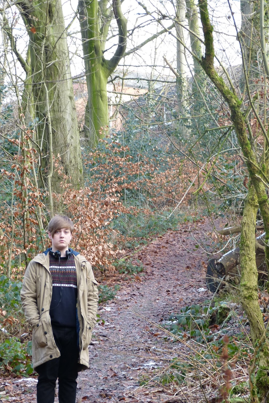
The first set of shots are a long wide shot giving the location of the shoot as well as a full body shot of the model 


I live the image because of the trailing path behind him with the trees hanging over giving depth and adding of colour I don't like the body posture and facial expression of the model though

This image I like for the same reasons as above with the depth and colour added to the image 

The images below are taken on the bridge camera with the auto focus as you can see it has focus on the things in the foreground, blurring out the model behind.  


This image I was going to use initially for my double page spread because of the large wall space where i could overlay the text but the model is looking away and it didn't fit the article I was writing 


This image I am going to use because it a wide shot allowing me to overlay text on the right hand side. it also gives depth  to the image and the little bit of snow works well