
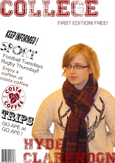
The image I choose was taken on a compact camera in a low light area shown by the yellow tinge on the image compared with that the music magazine image was taken on a SLR camera with a fixed light as you can see the resolution and clarity of the image is much better, with the college magazine i didn't fully understand what you need to do to convey the genre of the magazine if it take the college masthead off you would have know it was to do with a college I should have but in props in like a backpack or books which is meis on sen.


Theres a drastic difference in terms of everything on the two content pages the layout out of the college magazine is very poor and looks more like a poster with simple text and images to the side and a border, in the music magazine I learn't about page furniture and what is really needed on a page and how each thing has to work together like linking the text with the images shown on the right by a simple page number in the corner of each image, on the college magazine again their way too much white space on the page. the choice of fonts i found in the second magazine is vital to what message you want to convey the left is very generic and simple all one font and one colour, the right I used two fonts one large bold font for the masthead and heading and a simple easy to read font for the bulk of text. as i said with the front cover the images are very poor and do not link with the genre of the magazine, they were taken in a rush with no planning and added just because they were the best ones, with the music magazine I tried to link the images with the text with the number in the image corner I also thought about what the target audience would be interested in. I find that creating it for a target audience in mind allows you to create the best magazine for the particular genre with out stepping out of the limits.
No comments:
Post a Comment