Here are the shoots I took on location in the local park,for this shoot I used 2 cameras a bridge camera as well as an SLR, I choose to use the bridge camera as well because of some of the features that are not available on the SLR and also because of the auto focus it has.

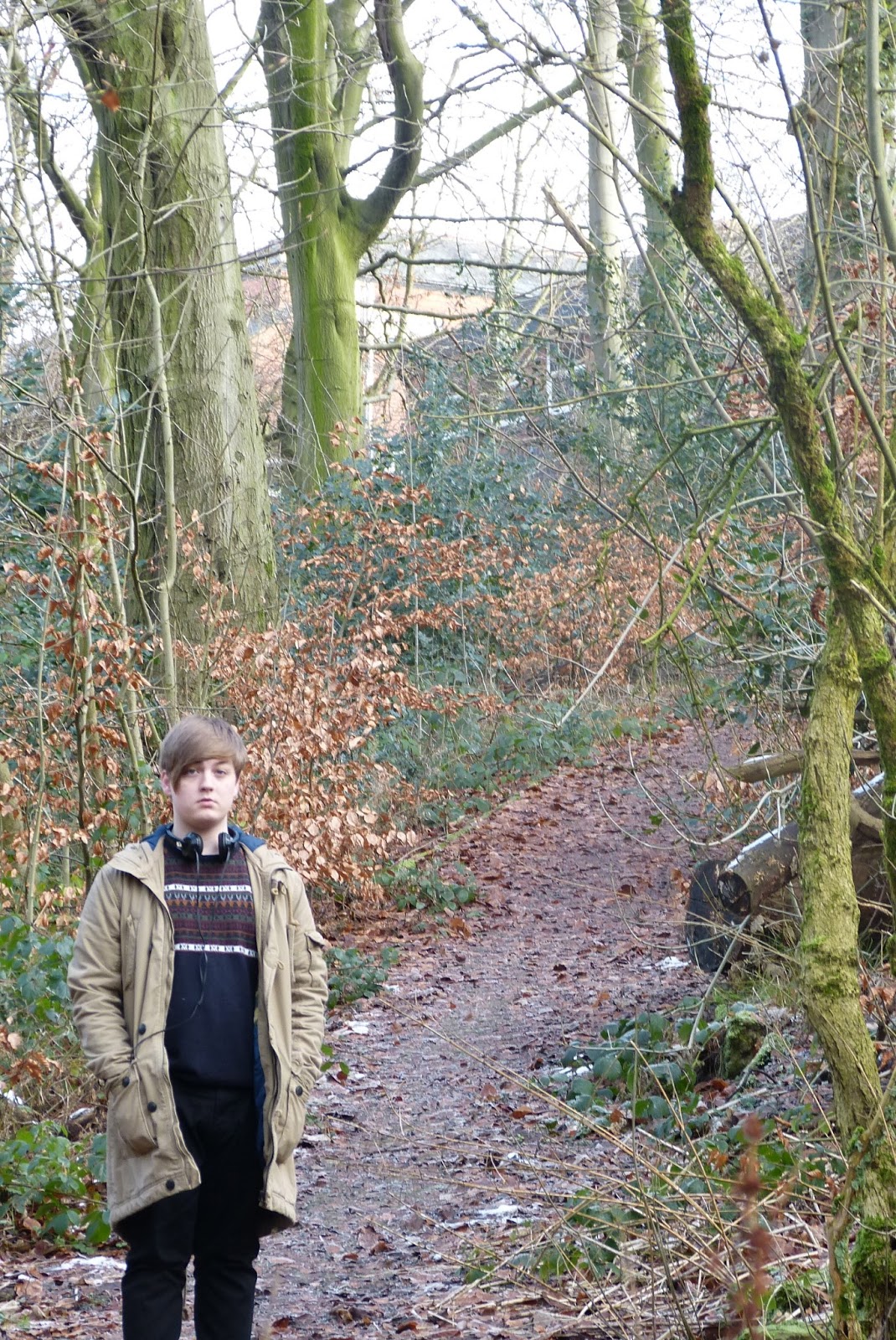
The first set of shots are a long wide shot giving the location of the shoot as well as a full body shot of the model
I live the image because of the trailing path behind him with the trees hanging over giving depth and adding of colour I don't like the body posture and facial expression of the model though
This image I like for the same reasons as above with the depth and colour added to the image
The images below are taken on the bridge camera with the auto focus as you can see it has focus on the things in the foreground, blurring out the model behind.
This image I was going to use initially for my double page spread because of the large wall space where i could overlay the text but the model is looking away and it didn't fit the article I was writing
This image I am going to use because it a wide shot allowing me to overlay text on the right hand side. it also gives depth to the image and the little bit of snow works well