 After talking to my tutor about the amount, quality and the direction of my work, I have decided to redesign my magazine to the styles of Classic Rock and Mojo music magazines. Both magazines use distinctive bold lettering in a serif style. With a two tone colour scheme hight lighting the cover stories. The layout of the magazine is centred around the photo both with a dark background, each has a masthead banner and cover stories down each side.
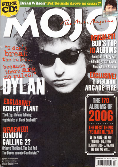
I am going to take the basic layout idea and adapt it to my magazine front cover, after creating a basic draft I will adapt the font and colour scheme to the content page and double page spread.
No comments:
Post a Comment